
A rather bold statement, wouldn’t you agree? Bear with us and let’s think about what that means for Saloodo! price predictions. Those are – in the end – indeed numerical estimates, and we are indeed bean counters. Nevertheless, we agree with the statement!
The (data-) science is not in the estimation of the exact price which we call the point estimate, it really is in the distribution of the price for different parameters of the shipment. The point estimate is what we show to shippers but it’s also kind of an incomplete picture! Of course, if you buy something you tend to believe that what matters to you is the price. But does it really? Arguably (and that’s what we want to convince you of) you don’t care for the price (alone). Rather, we’d like to argue that what matters to you is how the price compares to all the other possible (and impossible) prices. And that, ladies and gentlemen, is what a price distribution is -> its colloquially speaking prices relative to each other.
Distributions are of the essence of statistics because they tell us about the probabilities. The most famous such distribution has been described by a young man studying in the German city of Göttingen: Johann Carl Friedrich Gauß and many Germans still fondly remember him and his distribution from their Deutsche Mark bank notes! (FYI, Göttingen is a city that’s real beauty only reveals when enjoyed from afar while leaving it [Heinrich Heine Die Harzreise 1826]).

But how to work with such a thing and why does it matter? Probability distributions indicate the likelihood of an event or outcome. For a better understanding, we will describe the events using a series of values. The sum of all probabilities for all possible values must equal 1. Furthermore, the probability for a value or range of values must be between 0 and 1. Let’s consider prices: A price distribution indicates how likely a given price (range) is. More importantly by looking at the area left or right of a certain price you can get the likelihood of getting a price lower or higher than that fixed value!
Let’s apply this!
Of course, for shipments (or transports) we need to investigate comparable shipments such that this simplified approach makes sense. Meaning, for now, we shall only compare shipments where all parameters of the shipment (for example weight, size, from, to, etc.) are the same. If we can get a lot of such comparable shipments, we can plot their price distribution. If we are lucky, most of the prices will cluster around a certain value. If we are unlucky, they are only clustered a bit.
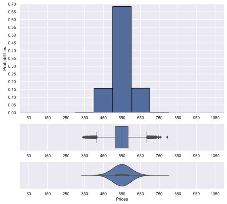
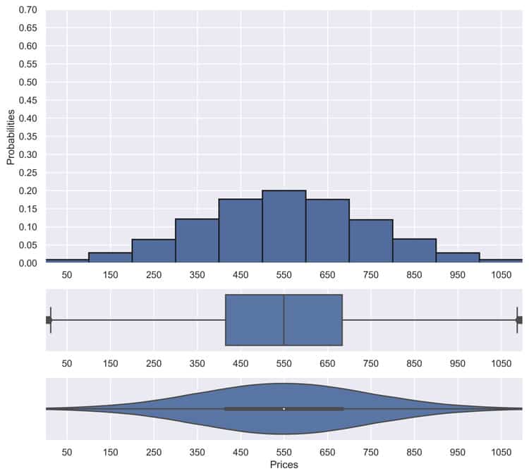
The good thing about the first distribution is that if we see (exactly) such a shipment in the future again, we can pretty precisely estimate what a good price is supposed to be (here it’ll be 550). For the second case, however, such a prediction is not as easy. Or, maybe not Possible in a meaningful way whatsoever (look at the plot, a price of 450 is as likely as a price of 650 and 550 – the mean price – is not much more likely either).
To be more precise, it’s possible in a statistical sense but maybe not in a sense that is satisfying to a customer. We only have so much information anyway.
The distributions shown above are not real cases (they are only meant to illustrate our point). How does this look in reality?

This figure shows the so-called box plots. Such plots indicate robust dispersion and location measures in one representation thus giving an impression of the area in which the data is located and how it is distributed. The size of the box, from a statistical point of view, contains half of the data points. The boundaries of the box kind of correspond to the width of the distributions in the previous figures (precisely: they range from the first quartile qn(0.25) to the third quartile qn(0.75)) Thus, colloquially speaking a big box means that the distribution is broad and a small box means that the distribution is narrow. Please note that these are cases where all parameters are the same (even with some of them the exact same day).
Another more precise way we can look into these distributions is the figure we show bellow. These are so-called violins plots, and they show an estimated shape of the distribution based on the real data. Again, broad distributions can be discerned from narrow distributions.
These are real cases that we encountered, and they are somewhat representative of what we see daily. In general, the deal price distributions are often narrow enough (as you can see above) but it can get pretty broad too (also evident from above).
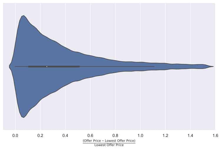
Dispersion is not limited to “deal” prices though. Let us also show you the relative variability of offers on the same shipment as we typically see them on Saloodo!. This violin plot shows the average offer variability conditioned on the single shipment level:
Single violin plot of offer dispersion. We calculate for each shipment on Saloodo! the relative deviation of all offers from the lowest offer. Thus, the figures indicates the variability of offers normalized to the individual shipments lowest offer.
Again, somewhat comparable, it’s obvious that the prices offered even on the single shipment level vary a lot.
The good news is that in many cases those distributions are narrow. However, as seen above, not in general. And at least from our perspective, looking into different datasets from different sources, we found high dispersion for at least some trade lanes in practically all datasets that we’ve ever looked at.
In some cases, this can be tracked down to errors. Maybe a digital process that doesn’t match a business process or somebody entering data the wrong way. Often, however, the price dispersion is really high for a certain trade lane at a certain time. There are many possible explanations for this. Some explanations we find often (not a complete list though, just some examples) are back-load opportunities, offline contracted additional agreements, special relationships, etc.
In data science terms, it’s because we’re missing a critical feature and sadly, these might even be features that we will never have or features that are useless if you want to know upfront and in general what the “good” price is supposed to be.
For a data scientist, this creates an interesting problem. Or more precisely, for machine learning where you’re supposed to return a single precise price, this creates a problem. Because, well, it’s not precisely possible in all cases. It’s still statistically possible to say something about the price distribution but the same is not true for a single value impromptu precise price estimate. At least not in a way that seems convincing to most people in logistics. This problem becomes even bigger if you consider that in machine learning we don’t compare shipments that are all the same in all parameters, but we rather extrapolate from some parameters to others, meaning that we don’t need shipments that are all the same, but we try to find out some general patterns such that we can derive predictions for shipments that have actually never been observed. We will write more about how we do this in a future post, but for now, let us just say that the problem does not become smaller by doing this.
Also, we must defer a discussion of what price means and whether it’s all the time the same and how they compare or relate to each other. To a later post, but nevertheless in closing and while trying to bind the beginning of this post to its end: We want you to get the message across that strictly speaking, getting a single precise price estimate, is sometimes possible, but more often than never it maybe not be feasible. Maybe it’s worthwhile to investigate the shape of the distributions instead? Or at least looking at some parameters, like how varying a price is instead of or additionally.
At Saloodo! that’s what we do! For carrier prices we report ranges and for shipper prices, we do show a price only if we are somewhat sure it comes from narrow distribution. There is still room for improvement though and we are still looking for a more intuitive way to communicate more about the distribution to our data customers.
Finally, let us say a final word of warning while leaving it open how it fits pricing for the next post:
Life expectancy is a statistical phenomenon. You could still be hit by the proverbial bus tomorrow [Ray Kurzweil].